When Your Client Asks .... What Should I WEAR?
May 08, 2016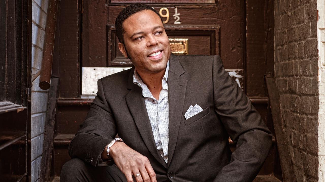
GETTING CREATIVE WITH COLOUR PALETTE
The #1 most common question we are asked when we are going to shoot a portrait? What should I wear? What colors?
I think back to high school art class: Color is the Enemy of Form. ...it's one of those "rules" and rules ARE made to be broken, but there is a LOT of truth to it, and I generally stick with this one.
When I am shooting complimentary colors (colors on opposite sides of the color wheel), I try for simple forms and minimal texture. When I have a small color palette (analogous colors), I often push the contrast and have LOTS of texture! I love textures in images, this image of Cuban Sonero Adonis Puentes, is one of my favorite music images for it's VERY small color palette: brown and light blue, and LOTS of texture.
When people ask you: what should I wear? Think about your environment, think about their personality; if there is LOTS of texture - trees grass, think "analogous color scheme", it feels very natural and has a calming effect on the image, does this match their personality? If you have simple environment, think color, it will pop on screen and speaks volumes about your subject.
What do you want to say about your subject? Vibrant? Boisterous? Calm or Confident? ...you can help say all these things with your choiceof colors and the textures they are surrounded by.
I look forward to seeing what you create, capture and share and make the world a better and more beautiful place.
Stay connected with news and updates!
Join our mailing list to receive the latest news and updates from our team.
Don't worry, your information will not be shared.
We hate SPAM. We will never sell your information, for any reason.
